Moral Decisions & Haptics in VR
Does feeling a virtual world change your moral decisions?
Role
UX & Research Methods Designer
Date
October - December 2015
While at
Carnegie Mellon University
With
Ivan Wang, Maddie Duque, Swetha Kannan
We created a VR environment to test an isomorph of the philosophical Trolley Problem. Some participants could feel the world around them while others could not. We found that participants who have haptic feedback are less likely save four people (by killing one person in reach) than their non-haptic counterparts.
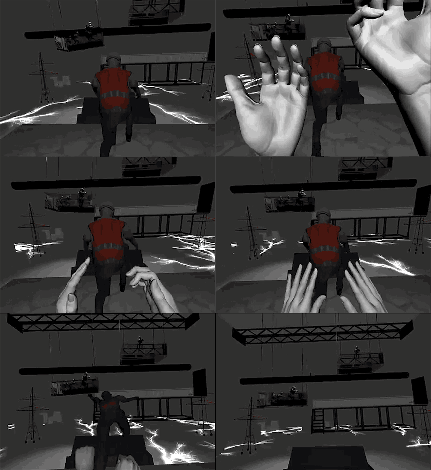
But there’s still a chance to save them. A worker sent to fix the electrical problem stands in front of me, bent over his work, oblivious to my presence. All I have to do is shove him to the floor below, killing him and shorting the electricity, which will spare the four people plunging to their death. I have 20 seconds to decide who dies.
[…]
Self-sacrifice does not occur to me; I’m paralyzed by indecision as soon as the alarm sounds. I can hear the workers screaming, but with my palms on a warm body, the four seem far away. Does this hint at a separate moral failing? It doesn’t matter; time is running out. Just before the workers hit the floor, I push the avatar, and Mr. Wang, to their theoretical, virtual demise. Even after I take off the VR rig and the headphones, I can’t shake the feeling that I’ve done something wrong. Before Mr. Wang leads me out, I make sure to apologize.Amy Dockser Marcus in the Wall Street Journal
Problem
More and more of our lives are mediated through technology. Does the change from tangible, real world interactions to intangible, virtual world interactions change our moral calculus? That is to ask: Do the capabilities of our interfaces (here, specifically haptics) change our moral choices? (They do.)
Setup
The Trolley Problem is a classic thought experiment in moral philosophy where an out of control trolley car is speeding down a hill towards a group of five people. You, standing near the tracks, see a lever that would switch the trolley onto new tracks where one person would die. Do you pull the lever?
The “fat man” variant is similar, but your choice is to push a large man onto the tracks to stop the trolley to save five people (and kill him).
Our experiment, the Elevator Problem, has a group of workers on a malfunctioning elevator dropping towards an electrified floor. If the participant pushes a nearby technician into the electrified floor, the elevator will stop and workers won’t die. This is an isomorph of the Trolley Problem: a scenario that is categorically equivalent, but looks different. We specifically explored the different moral and physiological responses between a haptic and non-haptic group. Haptic participants feel the person they are pushing with their hands whereas non-haptic participants do not. Additionally, we had a third group whose scenario used two buttons to control the descent of an elevator with four workers and one with one worker (more similar to the lever-based Trolley Problem).
Results
Our setup process as well as our experience. (The poor recording quality is due to our laptop’s limited resources. Participants saw a higher resolution version.)
Non-haptic participants pushed the worker 55% of the time. Conversely, haptic participants pushed the worker 30% of the time. Using Fisher’s exact test, we find the difference between the haptic and non-haptic groups to be significant at p≤.05 (p=.0014). Thus, participants were significantly more likely to push a person to their death if they did not feel that person against their hands.
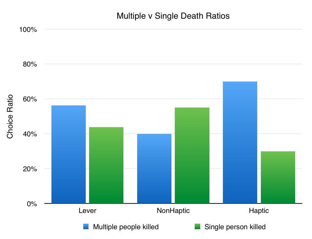
Moral decisions across groups.
Participants in the haptic and non-haptic groups both experienced an increasing heart rate as the experiment progressed (data was normalized in-group). Lever group participants’ heart rate did not change to the same degree, though this may be due to other factors.
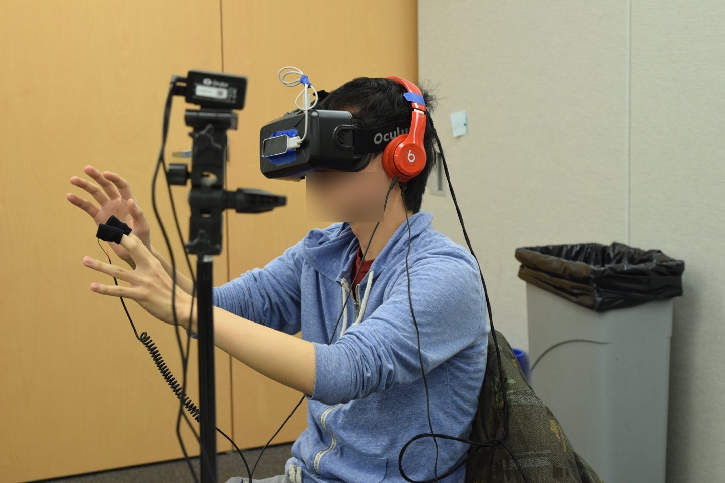
On this subject, you can see the abundance of the required technology: the Oculus DK2 on his face with the positional tracker on a tripod, headphones for sound, the Leap Motion on the Oculus DK2 to track his hands, a skin conductance monitor on his fingers, and a heart rate monitor on his ear.
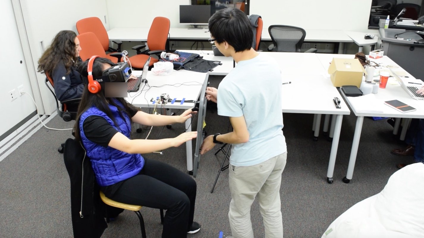
To fake haptic feedback for the buttons used in the first phase of the experiment, we used a plastic container lid.
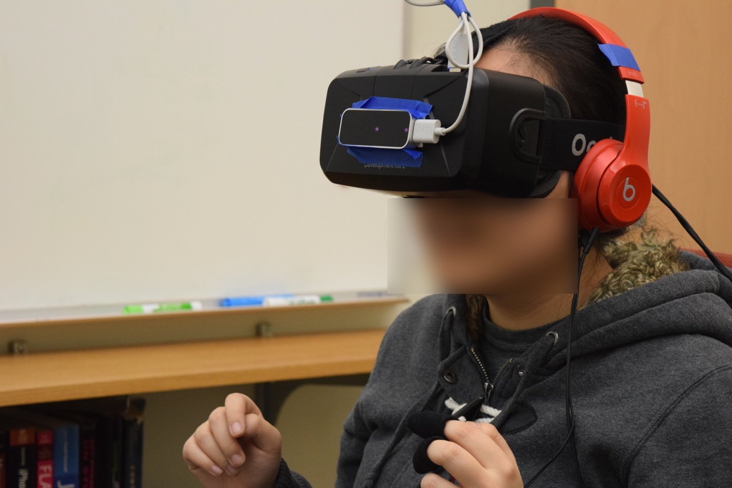
A common reaction of hesitation and terror.
We also ran into difficulties while performing the experiment:
- There was a high degree of variability and device failure in our electrodermal response data (skin conductance). As such we had to throw it out.
- Our lever group accurately controlled the two elevators in the training section of their scenario. However, when the floor becomes electrified and an elevator starts falling, participants were not able to remember how the system operated.
- Many participants were deeply immersed. Some walked away emotionally struck by the scenario. However, there were also some who never became immersed or they became immersed, but lost that immersion when our hardware failed.
Ultimately, we hold our findings from the haptic and non-haptic groups to be more valid than the lever group.
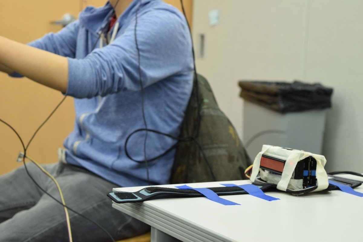
Image of our handmade galvanic skin response and heart rate sensors.
We tested 60 participants. While all participants completed the scenario, 4 datasets were thrown out due to technical issues. All participants were students or recent graduates of Carnegie Mellon University. A more detailed description of our methodology can be found on a Carnegie Mellon project showcase site.
My role & tools
Role
- With a bachelor’s degree in philosophy, I helped the team with any philosophical points and clarifications. This was especially important as we tried to create an easily understandable scenario that looked different from the initial thought experiment.
- I was the user experience designer on the team, clarifying usability and interaction issues. The rest of the team consisted of programmers and artists.
- I had worked and led more research projects than my counterparts. As such, I designed our research methodology and statistical analysis.
Tools
- Unity
- Leap Motion
- Oculus DK2
- Adobe Premiere
- Pen & paper
Process
This project started as a class project. Each student submitted ideas and, through a consolidation process, we all ended up in one of three groups.
We refined our work over six weeks with weekly playtests, class feedback, and feedback from class guests. We used the feedback to clarify our designs. This led to our final research experiment and written report.
Initial designs
The first week of work focused on (1) how we would translate the trolley problem variant into virtual reality and (2) which research questions to ask. From our earlier work in the class, we understood some of the limitations of our devices (laptop, Oculus DK2, and Leap Motion). Previous iterations of the thought experiment relied on the question-asker to force the question-answerer into either pushing the “fat man” or not. When faced with the decision, people often look for a way out. Presenting the decision in a game-like environment therefore did not lend itself to a realistic decision. It was our task to create an environment that was believable enough for the user to jump in, believe, and make a realistic decision.
The visual setup of the original problem requires the user to look in separate directions, put together that the trolley won’t stop, and what the available decisions are. To simplify the perceptual complexity, I suggested that we brainstorm isomorphs of the trolley problem (i.e. different setups that had the same salient features). We went through lasers, machine-gear deaths, conveyor belts, and gas chambers before we began to settle around our final “elevator problem”.
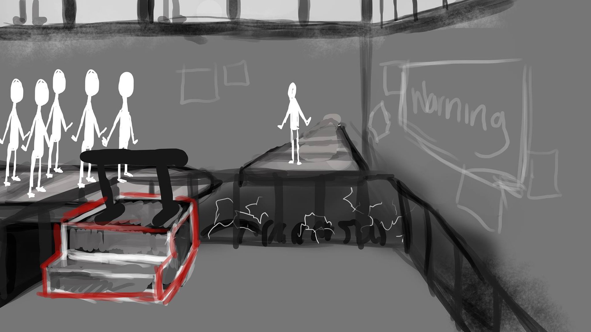
Early versions of the “Elevator Problem”. Here, we’ve settled on electricity as the death mechanism.
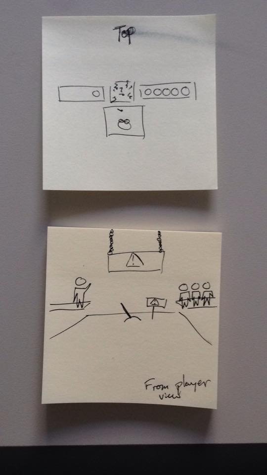
Visual implementation & refinement
After we had settled on our scenario and setup, we spent a few weeks refining the visuals in two ways: (1) visual design and (2) performance. On the visual design side, we worked to create an environment that was industrial and unlike a game. Due to our hardware limitations (a laptop running the Oculus DK2), we also did what we could to keep the game performant (e.g. lowering the polygon count on objects that are further away from the subject). The rest of the team had vastly more experience creating games and as such they did the performance work.
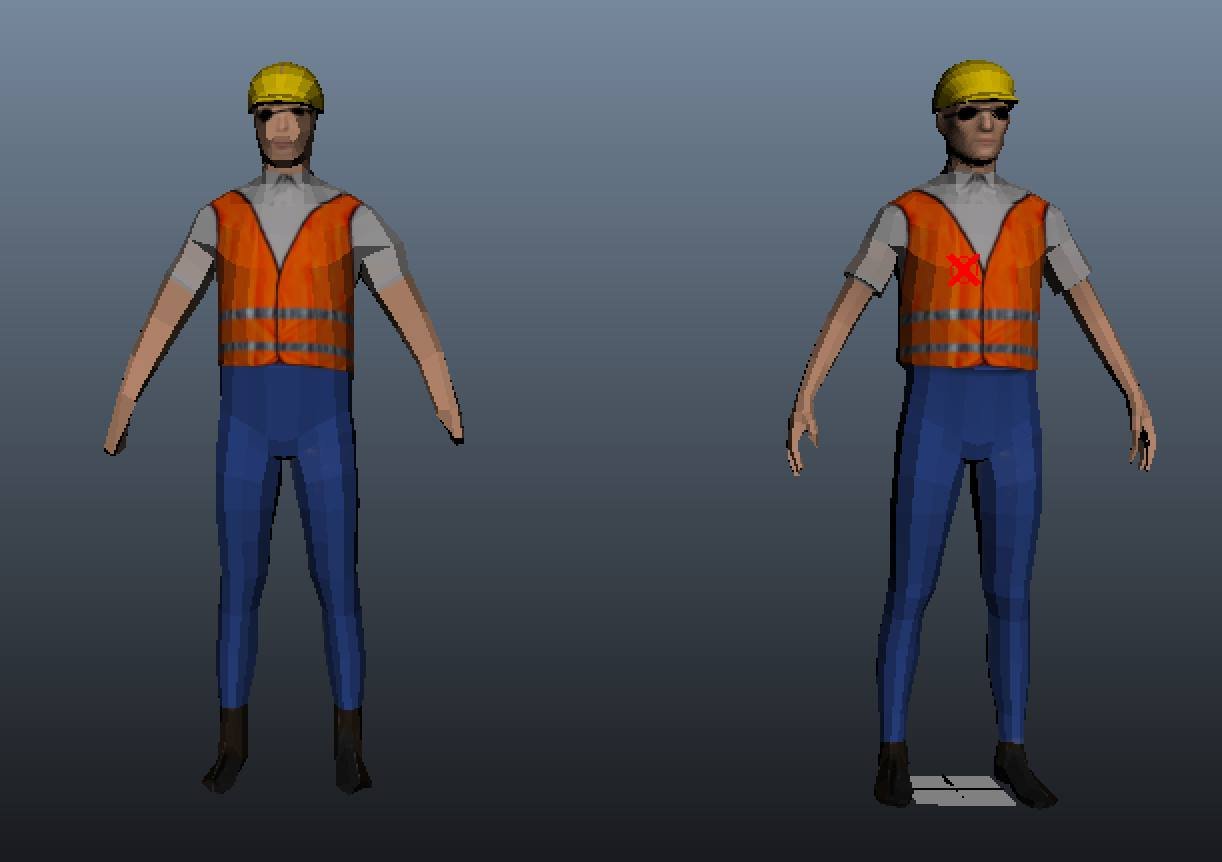
Two low poly versions of our worker model. Since we were severely limited with our graphics capability, low polygon counts were important to a high frame rate and thus decreased motion sickness.
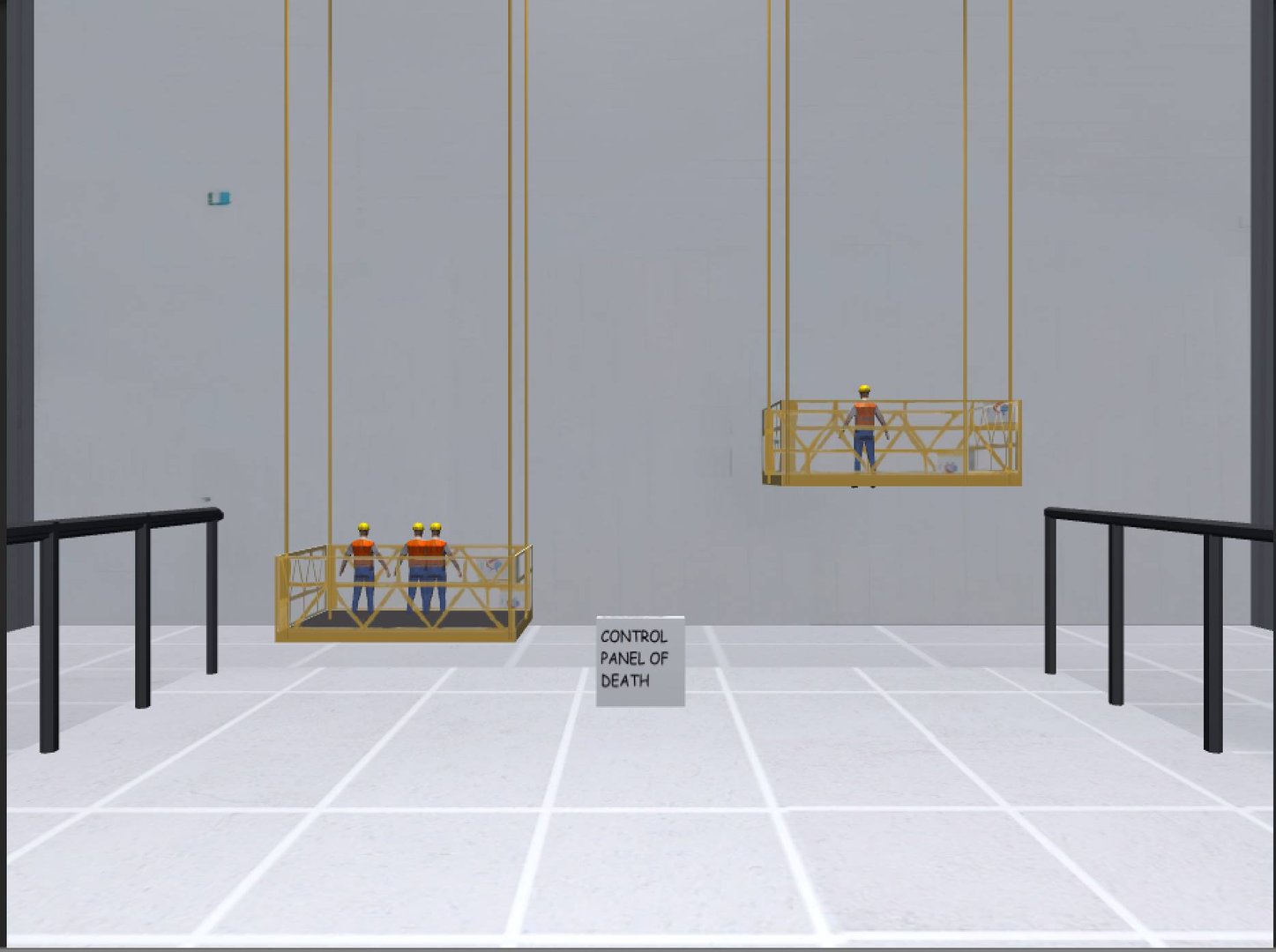
Environment after the programmers started implementing the design in Unity.
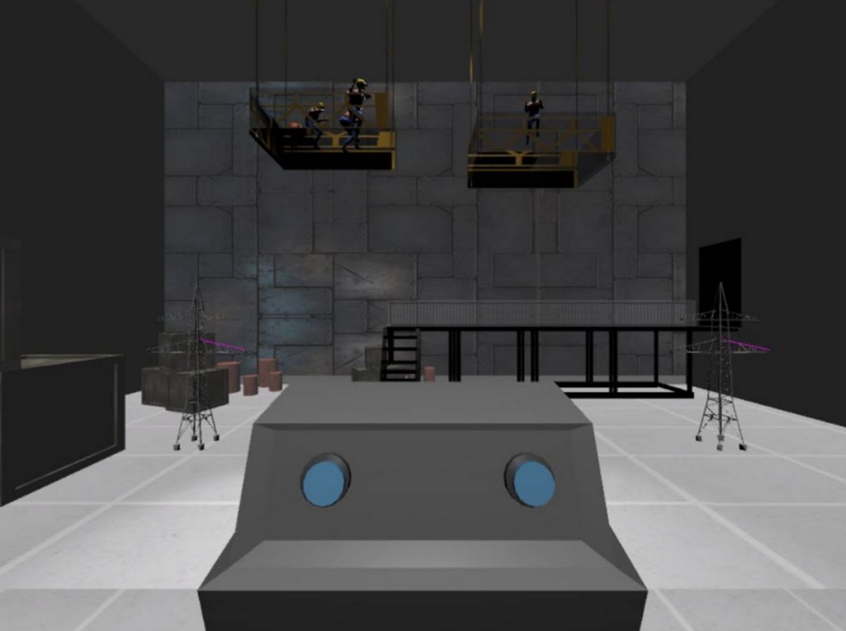
After much refinement.
Scripting & audio
We went through several iterations of our script. Like much of the visual and interaction design, we wanted to tread the thin line between pushing the participant to a decision and being entirely un-emotional.
Tom Corbett, our professor and one of the people who gave weekly feedback, pushed us away from our initial idea of an AI describing the scenario for the participant. He suggested that we use a scientist in our virtual facility to speak to the participant. A fellow human voice, he posited, would help the participant feel immersed because both the participant and voice-over scientist have a similar base for human morality (whereas an AI might remind them of Portal).