
Humane Virtuality
Researching the future of VR UX in week-long sprints
Role
UX Designer
Date
June - August 2016
While at
Over the summer during my master’s degree at CMU/M-ITI
With
Myself
For three months, I explored VR UX design with the goal of learning new technologies; designing humanely; creating rapid, interactive prototypes; and regularly sharing my work through case studies and weekly journals.
Context
My master's program had a summer off to do an internship
The timeline and various locations of my master’s program.
When I was in my dual-degree master’s program at Carnegie Mellon University (CMU) and Madeira Interactive Technologies Institute (M-ITI), we spent a semester at CMU, then two semesters in Portugal, separated by a one semester internship.
I didn’t find an internship that would let me explore what I needed to, so I decided to create my own. I spent a few months researching core VR UX challenges in shorter, focused design sprints.
Problems & goals
The big question: “What are the best practices for UX design in VR and how should we prototype our designs?”. I went about answering it with one to two week long sprint starting with a question, followed by a design exploration, prototyping, and user testing. I needed to also allocate time and resources efficiently, to ensure I got what I needed out of my internship.
In my process, I had four goals:
- Learn more software to help me express my ideas.
This was primarily A-Frame (JavaScript) and a touch of Unity. - Focus on creating humane designs.
I mean, this is really my role as a UX designer anyway, but it’s important to emphasize. As we move into humanity’s next dominant medium (spatial interfaces), we should do everything we can to make it a good one. (Inspired by Bret Victor.) - Design through rapid, interactive prototypes.
While apps and websites can easily be expressed on paper, spatial interfaces require prototypes that match its dimensionality. Additionally, I needed to get better at producing many prototypes to explore an idea. (Inspired by Linda Dong.) - Regularly share and interact with my greater communities.
Experimentation done in a vacuum is largely worthless. My own work has been informed from other early explorers. Because of my public efforts, others can start their work more easily. And, sharing regularly gives me a chance to refine my documentation skills.
I ended up publishing weekly journals and a few case studies under my Humane Virtuality Medium publication.

My role & tools
Role
- 👨🏻🎨 UX Designer: think, sketch, and define each experience/experiment.
- 👨🏻💻 Prototyper: build the prototypes in JS using A-Frame, create tools that can be used in the future to speed up the prototyping process.
- 🤔 User Researcher: getting feedback is incredibly important, but given the experimental nature and “earliness” of many of the prototypes, a few user interviews is all I need.
- ✍️ Writer: accurately convey my work and insights to the greater design and development community.
Tools
- A-Frame (webVR)
- Google Cardboard
- Sketch
- Adobe Premiere
- Pen & paper
Head tracked transform-ations
Experiment 1
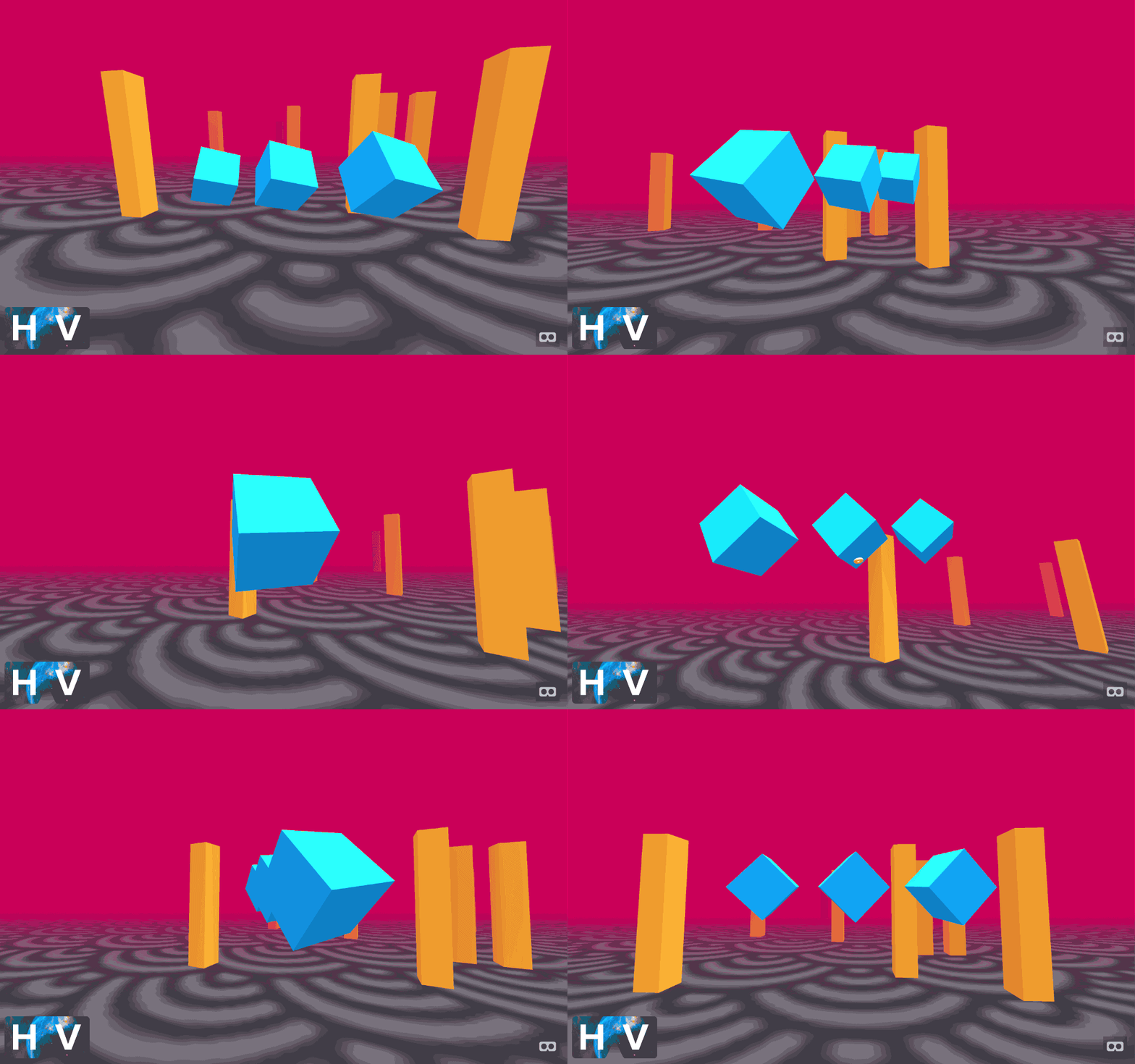
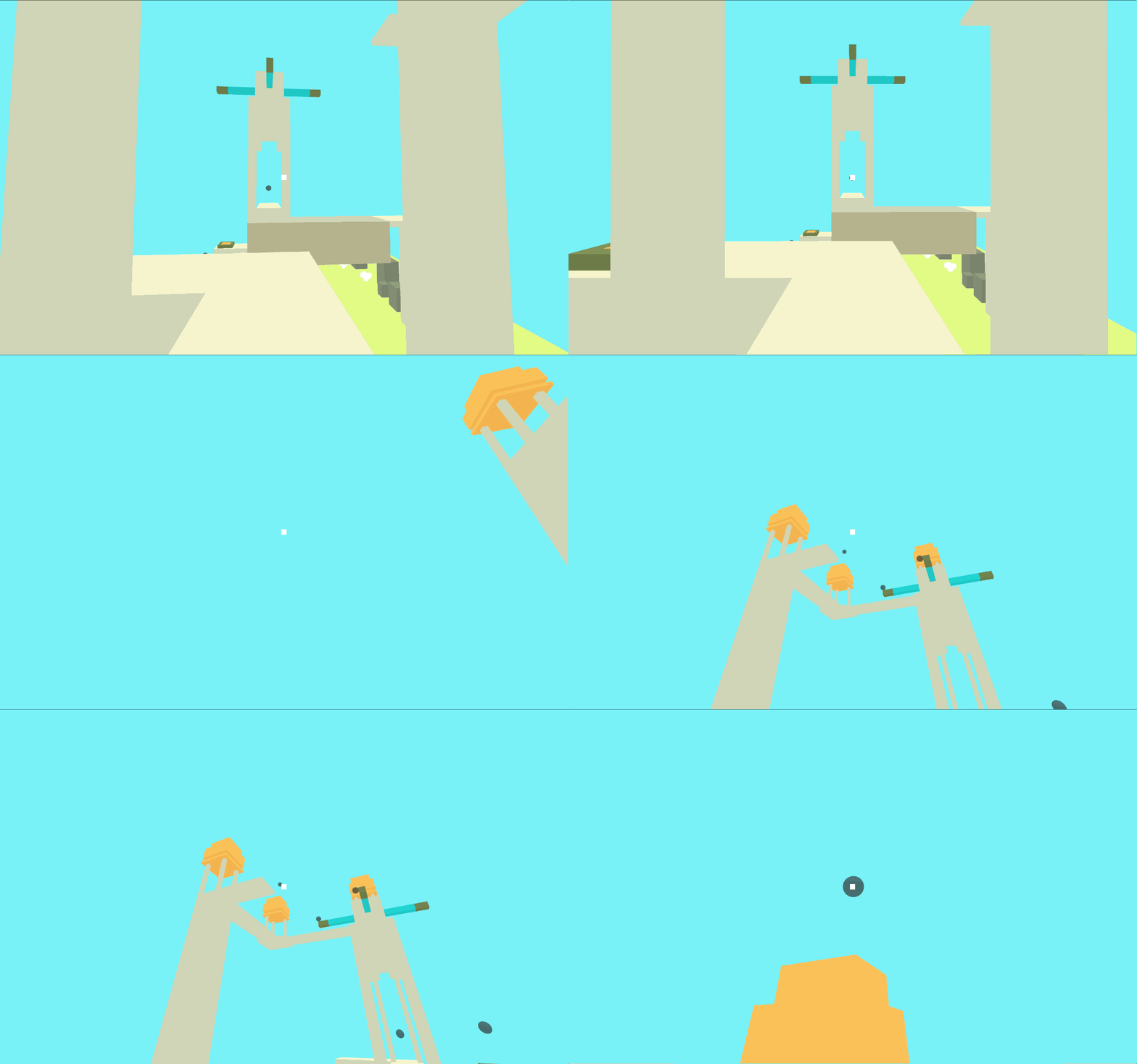
With this interaction mode, turning your head to the left, rotates the right side of the boxes towards you so that you may see the yellow doughnut otherwise hidden behind them.
How can a user see around an object if their headset doesn’t have positional tracking (e.g. Google Cardboard)?
I build an environment with togglable elements and various interaction methods:
- Rotate target with head rotation
- Rotate target with head rotation and scale the input (letting a user move a small amount to see behind the target)
- Rotate target inversely with head rotation and scale the input
- For each above method, toggle the target to be locked to the world or to a relative position from the user’s head

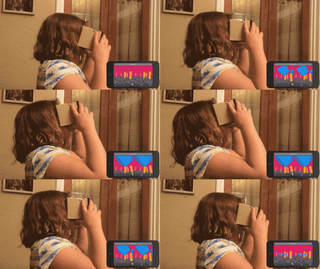
Two scaled interaction methods.
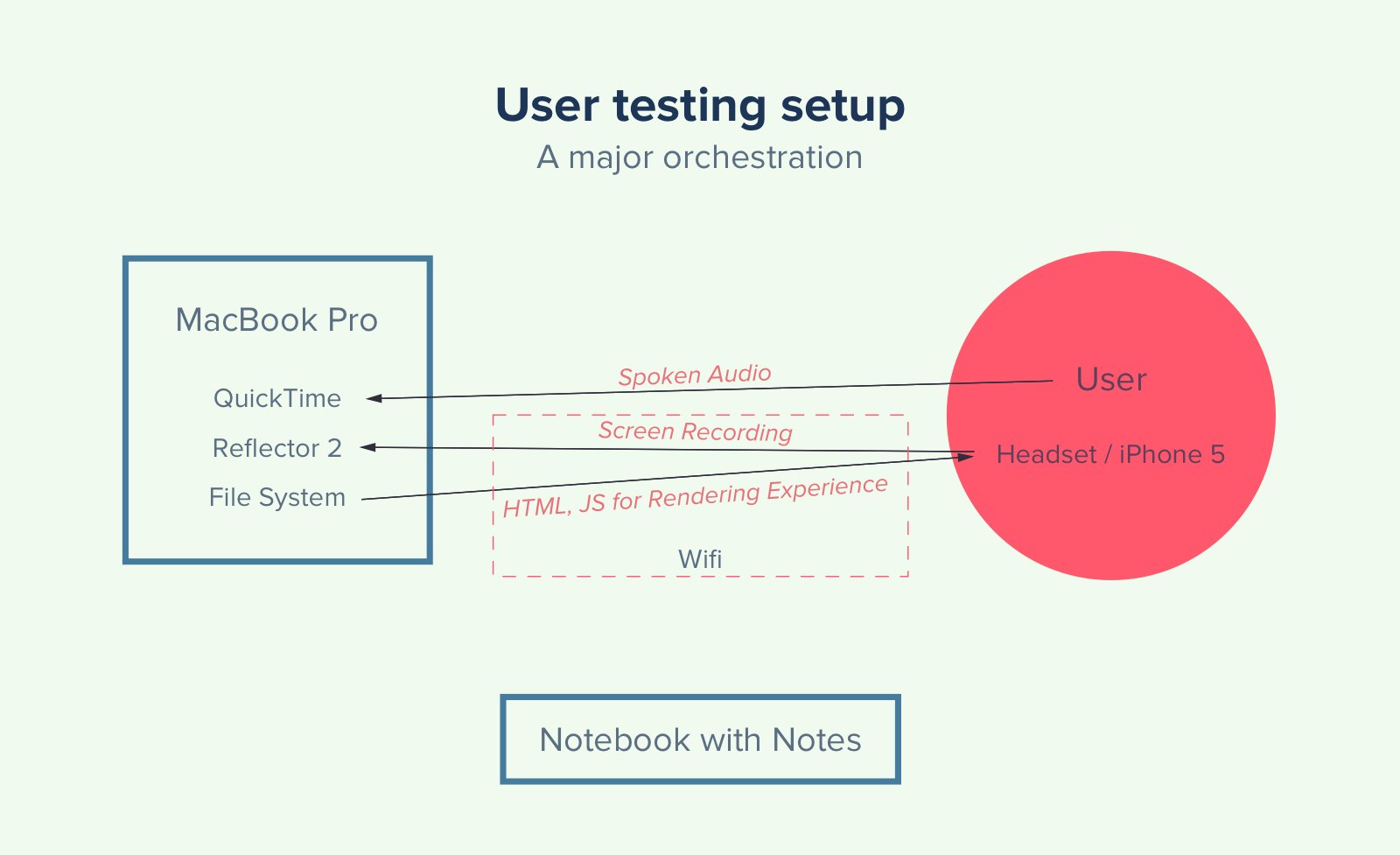
How I had to set up my devices to get meaningful data from user studies.
Overall, users appreciated the interaction and scaling function, but didn’t notice the difference between direct and inverse manipulation.
Product selection & customization
Experiment 2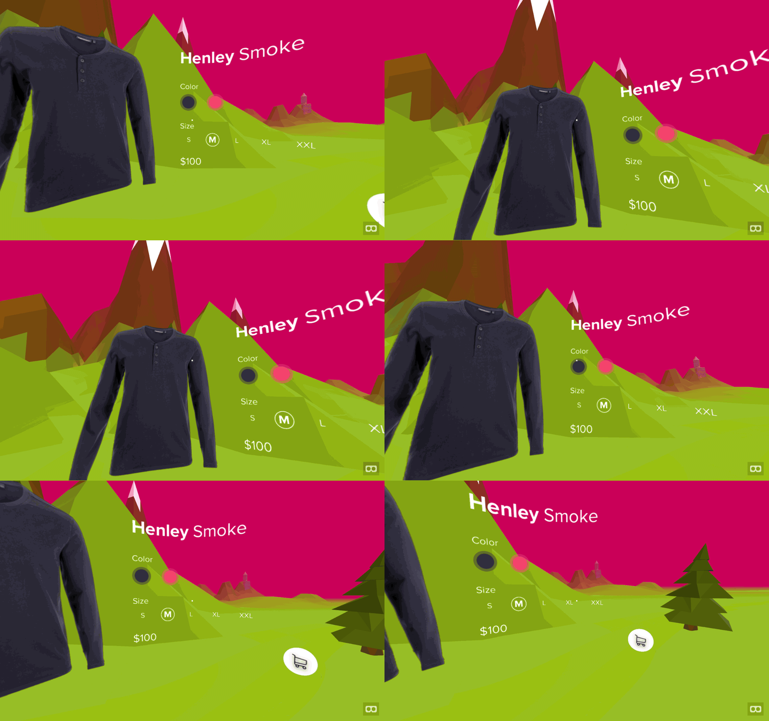
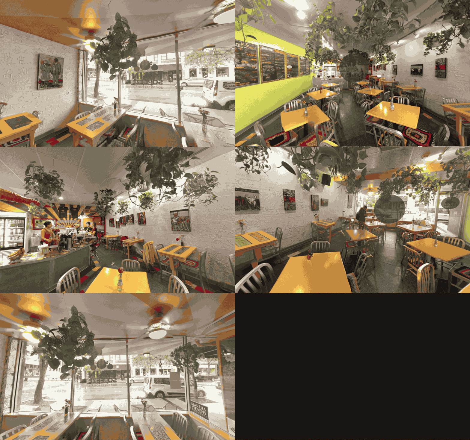
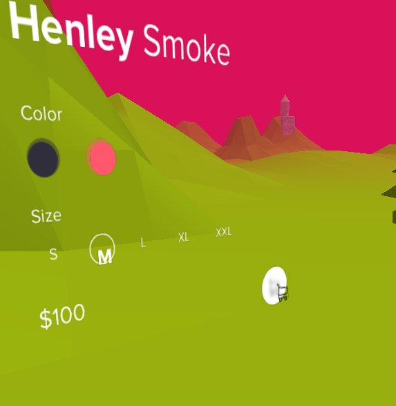
A 3D-ified mockup of a flat Dribbble mockup I ran across.
What can be learned by taking a design from the web and translating it into VR? Which design elements make it through the transition?
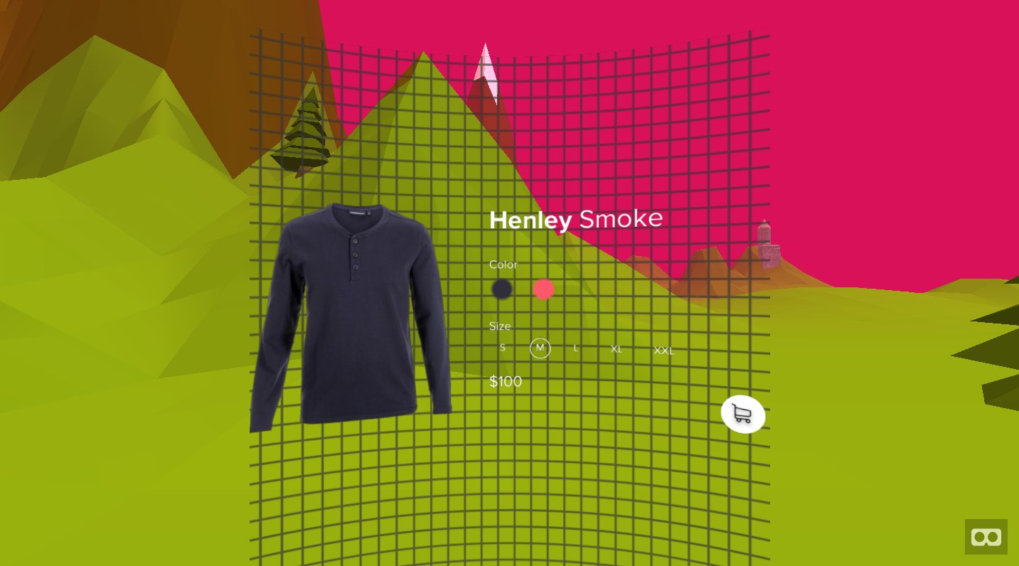
A grid I used to test a helper function that would draw an image on a partial cylinder
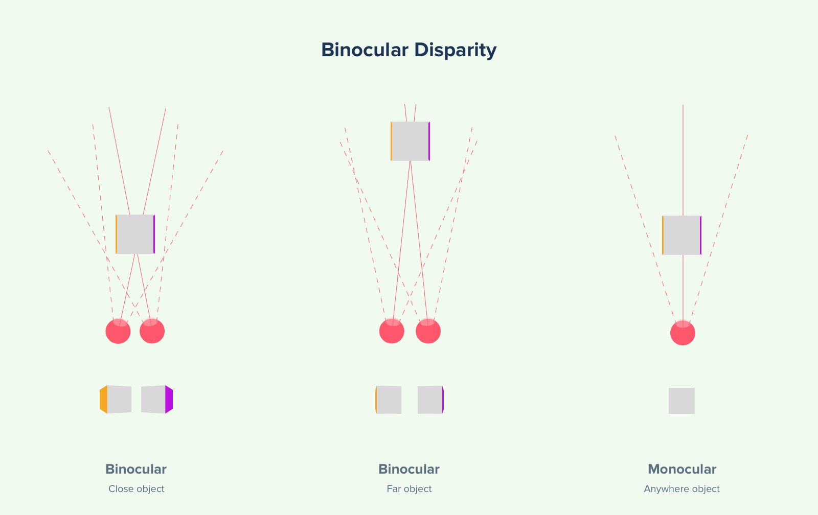
A diagram I made to illustrate binocular disparity in my case study.

A diagram I made to illustrate how a feeling of depth can be constructed from a set of planes or cylinders.
Curved mockups can be more pleasant than planar mockups because each point is equidistant to the user’s eye. Additionally, minor depth cues can make an interface “pop”. However, when viewing the scene from the monoscopic perspective of your development laptop screen, you can easily miss depth cues seen only with stereoscopic vision.
Environmental traversal
Experiment 6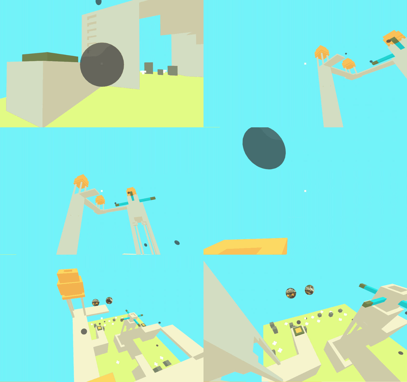
Linear animation without easing. Here, a user goes through all points between the start and end.
What are the best ways to move in VR (especially if you only have a 3dof headset)?

I created an ontology of ~20 ways to traverse environments in VR. This early sketch allowed me to make better decisions about which methods I wanted to build.

Jump cut. The user is instantly transferring between the start and end point. These are straightforward and comfortable, but can make the user lose context.

Micromovements. If jump cuts are the most comfortable, but make you lose context, what if the user went through a series of n jump cuts between the start and end points? I thought it was nifty, but the few people I tried it on thought the prototype was lagging.
Four and a half of these I prototyped: three simple methods (jump, fade, and animate) and one and a half complex methods (micromovements, and a partially implemented rotate-into).
Other experiments
The less interesting and/or unfinished worksVideo controls
Experiment 3
How do video controls change when the content is all around you (i.e. spherical videos)?
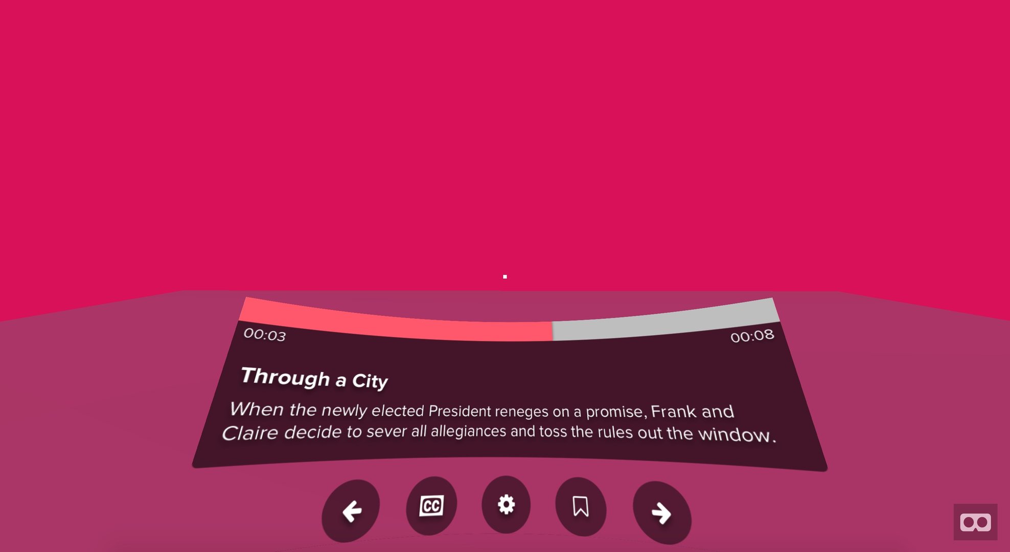
We moved from physical controls on television sets, to remotes, to UIs in our browser windows. Now we need to explore what comes next.

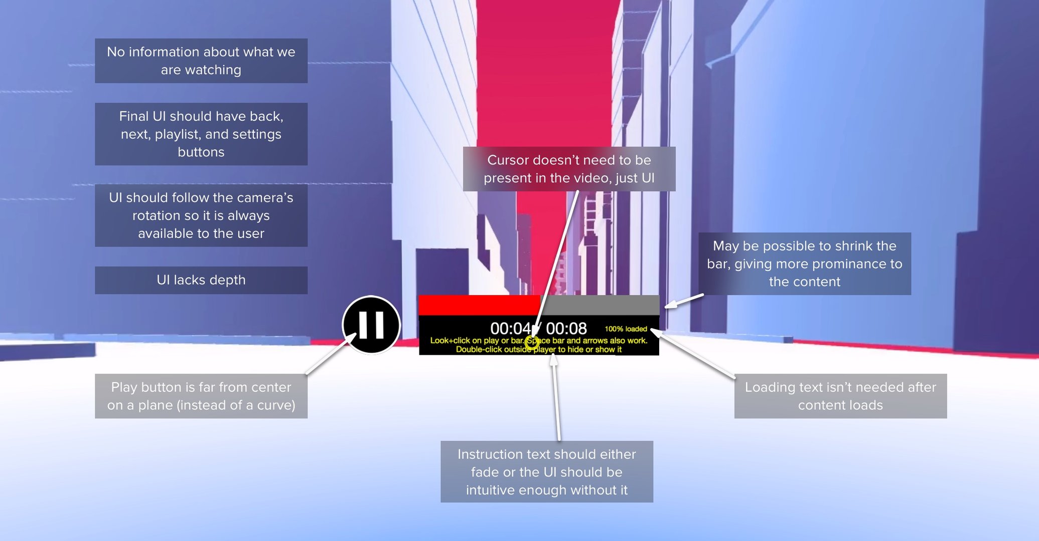
Critically examining @oscarmarinmiro’s video controls layout.
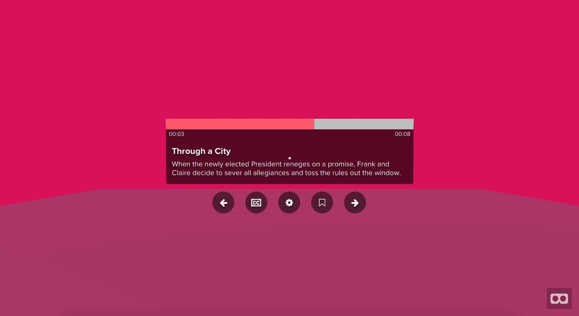
My first pass put the controls right in front of the user. This is uncomfortable because (1) the relaxed human eyeline is a few degrees down from horizontal and (2) it immediately gets in between you and the content (especially uncomfortable if you accidentally brought up the controls).
This experiment continued my exploration of differences between a planar mockup, a curved mockup, and a volumetric mockup while also exploring designs for spherical video controls.
Inspired by @oscarmarinmiro.
Solar system & SpaceVR simulator
Experiment 4 & 5
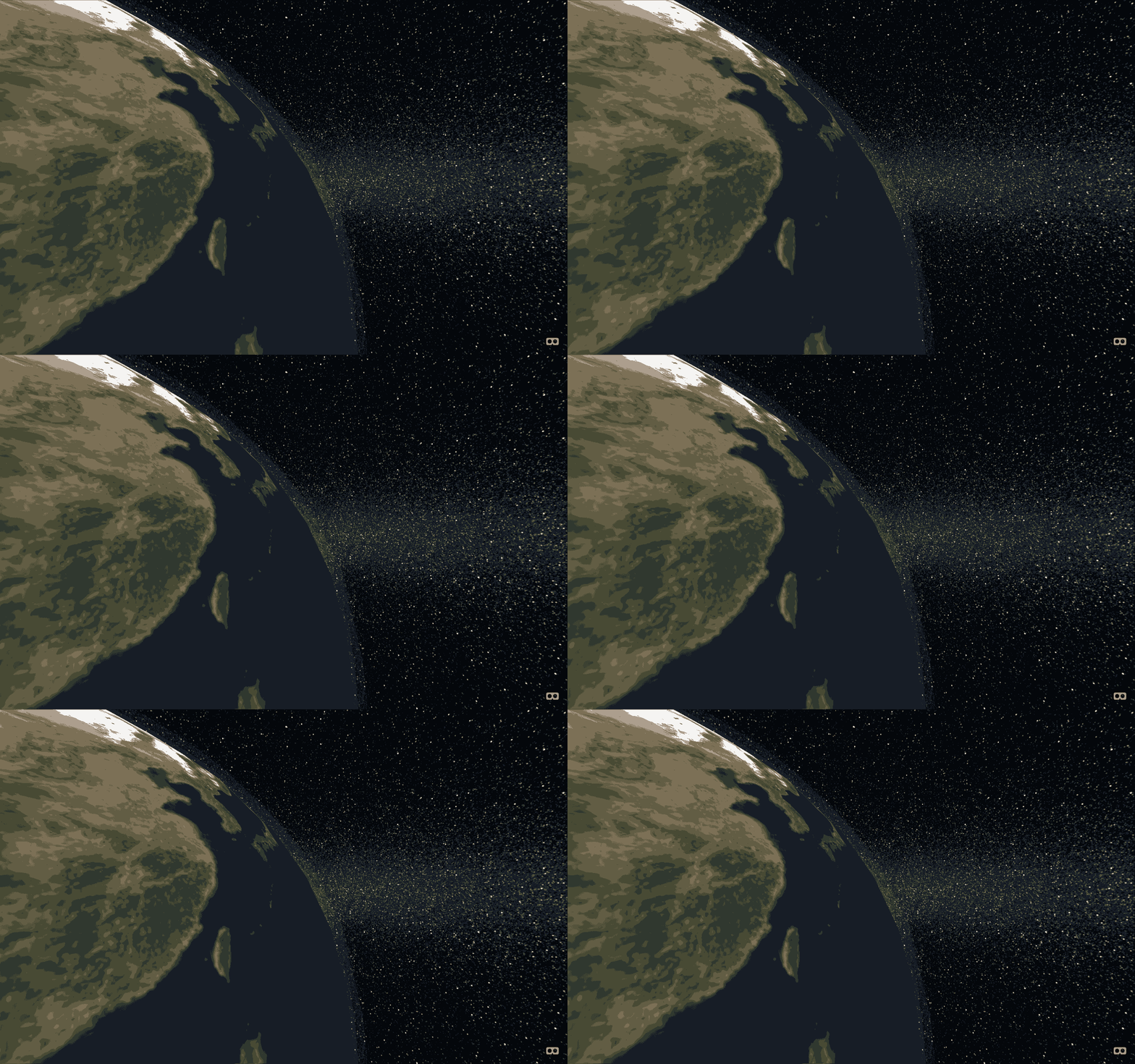
What does it feel like to see earth from a satellite point-of-view?

The Earth from just above.
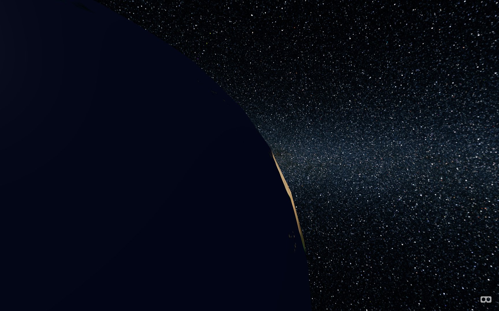
Before I applied the atmospheric effect to the Earth.
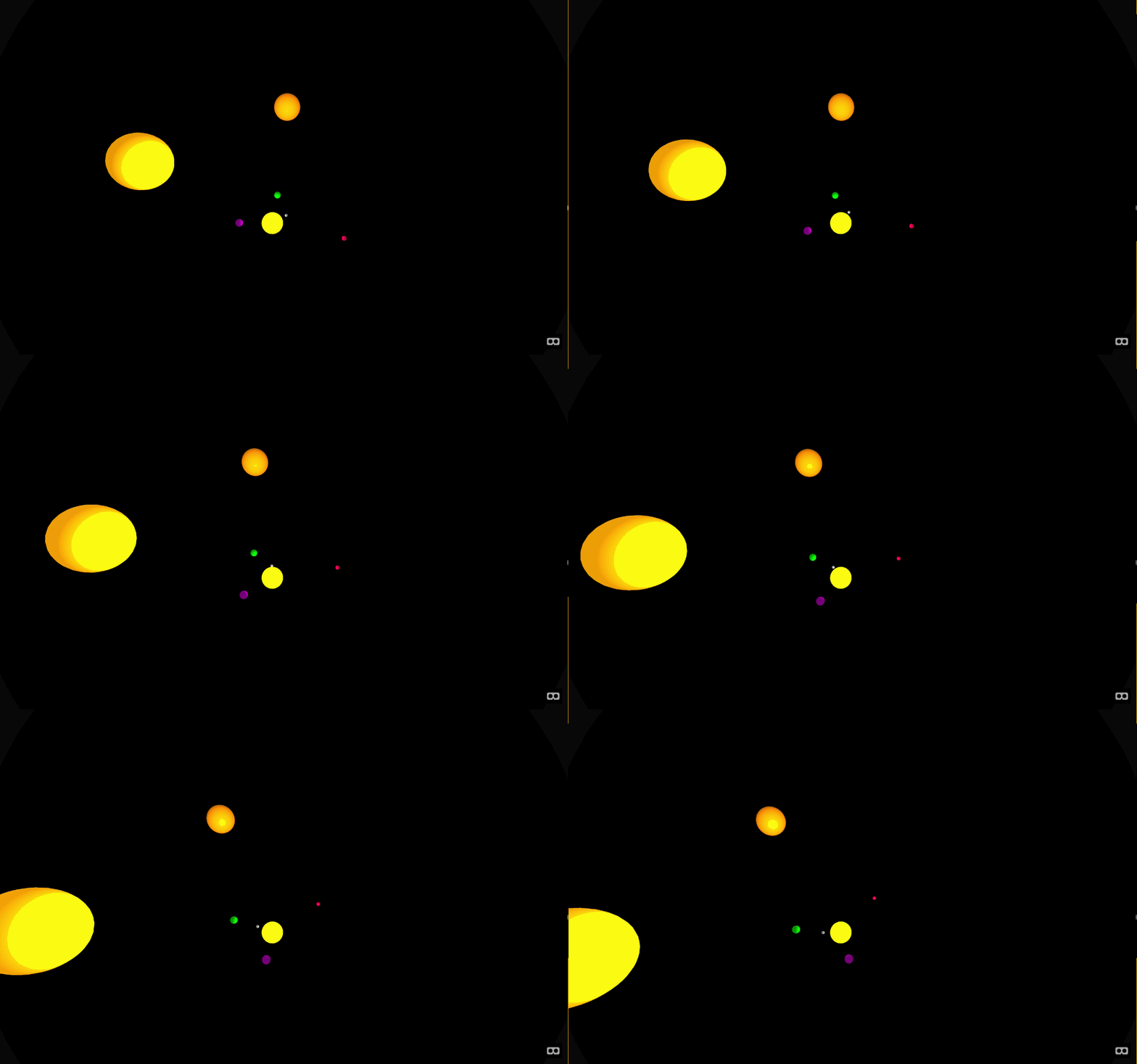
I started by trying to make the whole solar system, before I realized I should scope down more to just the Earth.
After hearing a podcast on SpaceVR, I was inspired to create an experience based on their project. Their goal is to send a satellite into space which would capture spherical video people on the Earth could experience in VR.
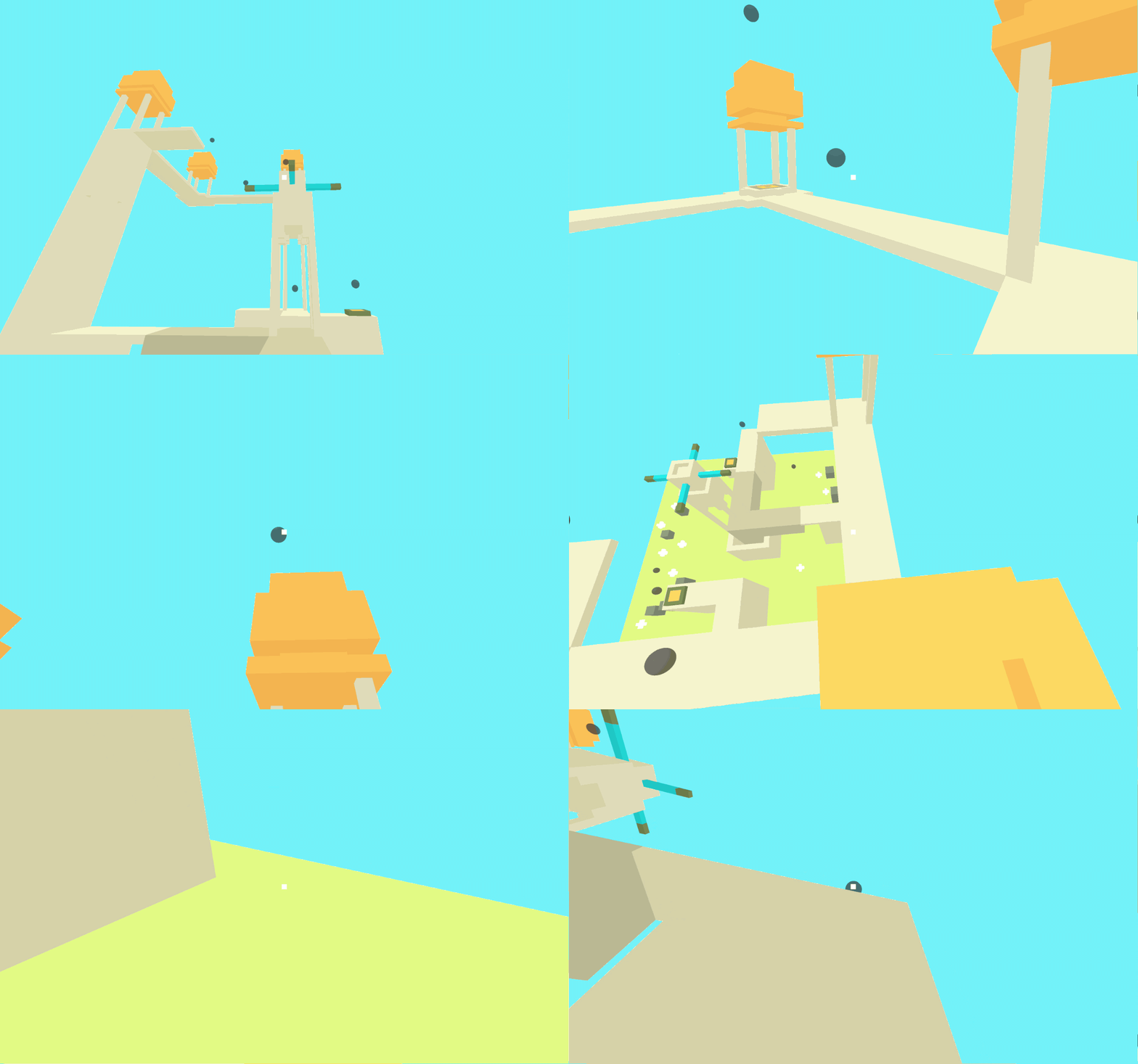
I started by building a model solar system where I had a lot of control over where I could place the camera, yielding a set of viewpoints. However, I realized I was building something more complicated than I set out to do. So, I wrapped it up and re-started. For my second attempt, I had a clearer project in-mind: less robust, more to the point.
Reality Editor
Experiment 7
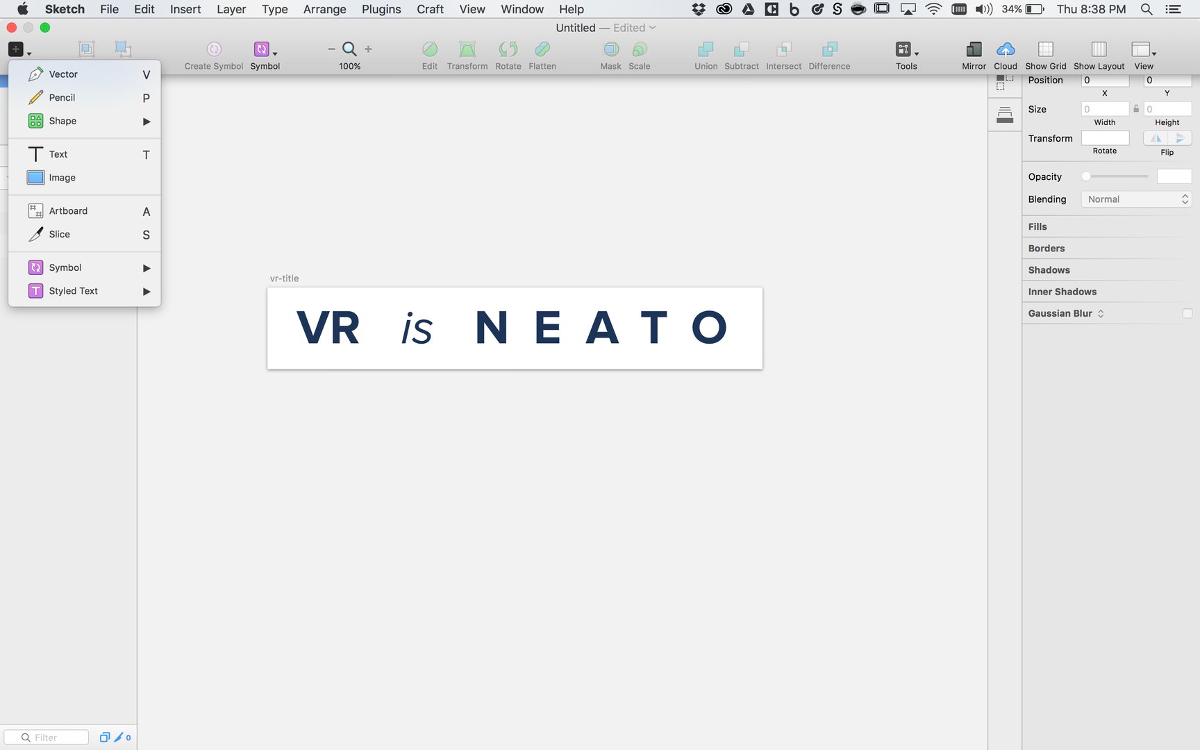
I concluded my internship by researching what was needed to create an effective and approachable VR creation tool – something between Sketch, Framer, and Unity.
Overall learnings
Each experiment looked at a very particular VR UX problem. After working with enough specifics, I can generalize my design insights and prototyping expertise.
Design
- The world wraps around the user. Utilize all of it.
- Text with too much depth hurts legibility.
- Sketch in 20 directions before choosing one to build.
- Volumetric design tools geared towards UX work are highly limited, but opening quickly. Figure out your own best-practices.
- Small cursors on screens with low-pixel density tend to jump around.
- A few techniques used in different industries are starting to come together: cinematography, theater (especially stage design), and traditional UX.
- You have a community. Use it and let them use you.
Prototyping
- Like other prototypes, have a good idea of what you’re building before you build. Go ahead and shift direction as you learn though.
- 3D models, especially ones from hand-written code, take time to make.
- Not all prototypes need 3D models.
- It’s über useful to have working knowledge of spherical and cylindrical coordinate systems.
- It’s useful to build a personal library of helper functions.
User studies
- User testing interaction experiments is more open-ended than testing robust apps. Think-alouds work well.
- Users get distracted. Let them know they were heard, then push them in the direction you are interested in.
- Given the state of consumer-awareness and experience, it’s likely you’re the first person to give your test users access to VR. Let them be amazed.
- Focus on what you’re testing. If the visual design isn’t important, use someone else’s work there.
- A few settings variables and keyboard shortcuts exponentially speed up personal testing during development.